

Hey guys, today in this blog post, we are going to discuss Aesthetic PowerPoint Templates: What Is Better. So keep reading.
Design is key to making an appealing presentation. It grabs attention and shapes decisions. A strong visual style can attract new customers. It can also boost conversions, increase sales, and help get investor funding. Many principles from Tips To Increase Affiliate Sales apply to presentation design. Engaging visuals and clear messaging capture and hold an audience’s interest.
MasterBundles helps you choose between creating your own aesthetic slide design or customizing a ready-made template. At the end of the article, we will show you some stylish sets you won’t be able to take your eyes off!
How To Make an Aesthetic PowerPoint Template?
First, let’s look at the features of choosing or creating a design. Then, we’ll decide which option is better. If you’re motivated to create a template from scratch, here are the key points to consider:
If the structure is difficult to work with, use a grid layout to create an aesthetic design. Margins can only contain callouts, such as page numbers. Align text with images along the guides inside the workspace. The grid removes visual debris, making it easier to read information.
Use running titles effectively in your presentations. Running titles show the page number and a company name or logo. This helps keep brand consistency across the slides. Creating your own blog logo helps you build a professional visual identity. This identity fits well in presentations and branding materials. To boost functionality, clearly present upcoming information. Include details like your website address or section name. This is important for marketing and mailing presentations.
Reduce the amount of text (no more than 50 words per slide) and structure the remaining blocks. Paragraphs make reading easier. They provide structure to the text, both in meaning and appearance. This way, readers are less likely to reject it.
Use order by size. Clearly separate the title from the main text and secondary blocks. Also, for the obvious size contrast, you can separate the title in a different font.
Don’t go overboard with fonts. We recommend using no more than two fonts in a presentation. Also, stick to two font weights. This keeps your slide layout clear and simple. One bold font for the title and a normal font for the body text is enough.
Style the text. It’s desirable to align text blocks to the left. Do not stretch it to its full length — for comfortable perception, the line should fit from 40 to 70 characters. A reader might lose track of the line or meaning when moving from the end of one line to the start of the next.
No long lists. Keep your product, brand, or service benefits to 3-5 lines. More points can be tough to remember and can make the text look messy.
Contrast is everything.
Some different highlighting techniques are:
- Increasing the size
- Using color
- Adding a colored background
Don’t leave text on a photo if its background interferes with readability.
Remember to repeat elements. For your presentation to be perceived as a coherent project, adhere to a single content delivery system (the same fonts, effects, headings, etc.).
Do not litter slides with a mass of elements. Sometimes, it’s better to leave some space than to take up every inch of the background.
Of course, use only high-quality images—otherwise, all the work you’ve done to create an aesthetic presentation will be wasted!
How To Choose a Slides Design?
If you want to pick from the best PPT themes with ready-made designs, you’ll need to spend some time comparing your options. The ideal option should meet the following points:
- High customizability;
- The presence of 3+ palettes or a day/night theme to adapt the design to the lighting.
- Rational structure;
- Availability of at least 30 slides in one set;
- The slides should have unique designs. Buying a big bundle with the same slide in different colors doesn’t make sense.
Check if the marketplace can sell this template with a commercial license. This way, the design can be used legally to promote the company’s products or services.
Choose Or Make It Yourself?
Making a presentation template from scratch can take a lot of time and effort. A custom design can showcase your brand well, but it might take hours or even days to finish. If you want to save time, using ready-made aesthetic PowerPoint templates is a smart choice. A great way to boost your agency’s brand visibility is to choose customizable templates. These templates should match your brand, company, product, or service. They help maintain a professional and consistent look.
Six Examples Of Gorgeous Aesthetic PowerPoint Templates
To help readers find the right options and create templates, we’ve gathered some stylish PPT templates and designs. Each of them is worth your attention! So, meet the six splendid templates:
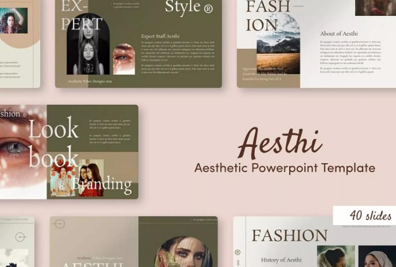
Aesthi Aesthetic PowerPoint Templates
Aesthi is one of the most popular Aesthetic PowerPoint templates in the list. A unique layout of elements and text layers doesn’t always mean the design is messy! In this template, this technique works great, along with a beautiful colour combination.
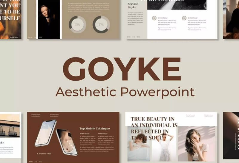
Goyke — Aesthetic PowerPoint Templates
A combination of white, beige, and different shades of brown is always a great idea! The layout of text blocks and photo zones helps you read quickly. It makes the presentation’s message clear.
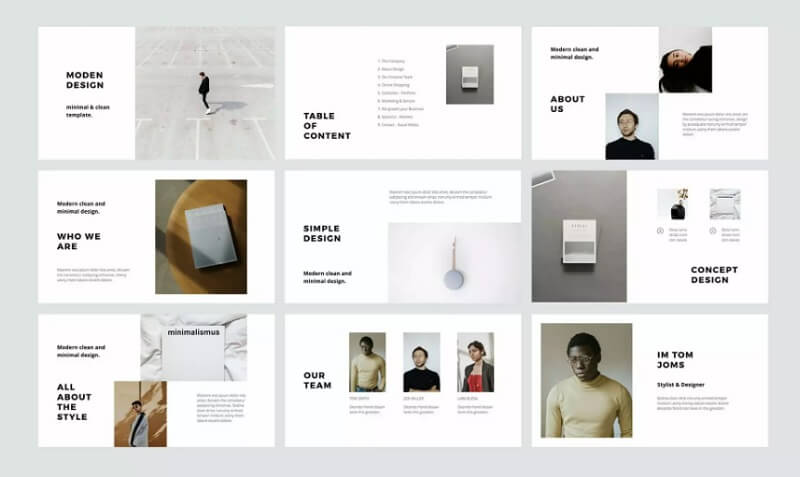
MODEN — PowerPoint Style Template
This template is an example of aesthetic minimalism. The design features a white background, black text, and shades of grey for emphasis. The template is super versatile, and its 40 pages fit any topic.
Digital Marketing Presentation Template
Aesthetics is not only about restraint and pastel colors. This template is great for digital marketing presentations. It has unique highlights, such as bright colors and gradients. Still, it stays stylish and visually appealing.
Vzrine — Person PowerPoint Template
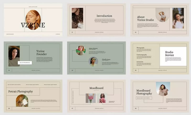
The Vzrine template boasts a classic and elegant design. It features a grid layout, linear elements, and soft colors like beige, green, and pink. It’s perfect for modeling portfolios, beauty brands, or ads for perfumes and skincare. A tidy layout highlights products well, like the guide for adding items on Amazon Seller Central. Good presentation and display are key to attracting customers.
SINA – PowerPoint Style Template
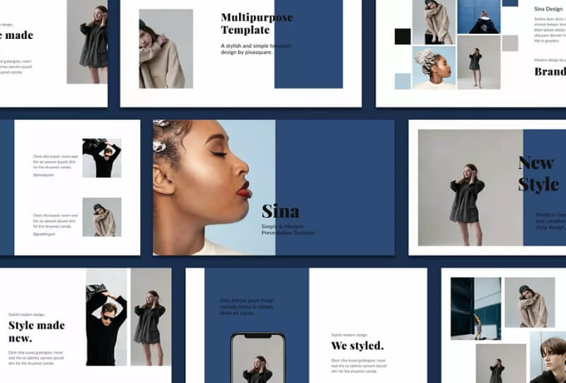
Another great aesthetic design. There are only two main colours here — white and blue, but the presentation doesn’t look dry. Besides this, a large amount of space allows you to place plenty of visual materials and reveal any topic.
Create From Scratch vs Ready-Made Aesthetic Templates
| Feature | Create From Scratch | Ready-Made Aesthetic Templates |
|---|---|---|
| Time Required | Very High | Very Low |
| Design Skills Needed | Advanced | Beginner-Friendly |
| Customization | Fully Customizable | Highly Customizable |
| Cost | Can be expensive | Affordable |
| Professional Look | Depends on skills | Professionally designed |
| Ease of Use | Complex process | Easy to edit |
| Best For | Designers & professionals | Beginners & businesses |
| Presentation Speed | Slow creation process | Fast presentation setup |
| Visual Consistency | Harder to maintain | Already optimized |
| SEO & Branding Benefits | Custom branding possible | Easy branding integration |
Frequently Asked Questions
What are aesthetic PowerPoint templates?
PowerPoint presentation design templates focus on:
- Attractive visuals
- Typography
- Color schemes
- Slide layouts
They are professionally made to enhance your presentations. These templates help you create eye-catching presentations. They’re great for business, education, marketing, startups, and portfolios.
Why should I use ready-made PowerPoint templates?
Pre-designed PowerPoint templates are user-friendly. They include ready-made layouts, fonts, colors, and slide designs. They help newcomers to PowerPoint create solid presentations easily, even if they aren’t professional designers.
Are aesthetic PowerPoint templates good for business presentations?
Aesthetic PowerPoint templates work great for business presentations. They boost professionalism, improve clarity, and engage the audience. Well-designed slides help businesses share ideas clearly. They impress clients, attract investors, and boost communication. They are great for meetings, product presentations, and influencer marketing. Strong visual storytelling can really impact the audience.
How do I choose the best PowerPoint template?
When choosing a PowerPoint template, consider these key points:
- Simplicity
- Easy editing
- Responsiveness
- Variety of slides
- High-quality images
- Color options
A good template is supposed to fit your brand and presentation style as well as suit the audience.
Can aesthetic PowerPoint templates improve audience engagement?
Yes, aesthetic PowerPoint templates can significantly improve audience attention and participation. Clear slides are easier to understand and more fun to watch. This keeps the audience interested during the presentation. Colors, fonts, images, spacing, and visual hierarchy are tools for engaging your audience. They help keep viewers focused and make key information easier to remember.
Conclusion
Attractive PowerPoint templates are great for creating modern, professional presentations. They save you time and effort in design. Create your own presentation or adjust a template. The goal is simple: enhance the viewer experience and share information clearly.
A good presentation does more than simply look attractive. It improves communication, strengthens brand recognition, and leaves a lasting impression. A good presentation, just like a business communication app, helps teams share information clearly and consistently. Choose the right template. Use consistent visuals. Keep the design simple. This way, your presentations will stand out and clearly communicate your message.