
Do you need to create better visualizations of your data? Are you looking for easy-to-use data mapping software that can help improve your analysis? If so, keep reading! This blog post will discuss some of the best and easiest-to-use data mapping software options available. We will also discuss what data mapping, visualization, and analysis are and give tips on how to get started.
The Basics Of Data Mapping And Why It’s Important
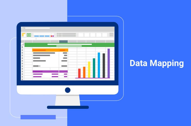
Data mapping is the process of creating a visual representation of data sets to better understand their relationships. It can be done using various tools, including spreadsheets, diagrams, and flowcharts.
Data mapping can be used to track patterns and trends, compare data sets, and identify gaps or outliers. It is an essential tool for data analysis and can support decision-making in a variety of fields. For example, data mapping was used extensively in the aftermath of the 2010 Haiti earthquake to track the distribution of aid and identify areas for further assistance.
In the business world, it is often used to track customer behavior, optimize marketing campaigns, and predict future trends. As the digital world continues to expand, data mapping will become increasingly important in all walks of life.
How Data Mapping Software Works And Their Key Features

Data mapping software typically includes a variety of features that make the process easier, such as the ability to track multiple data sets, create visual representations of data movement, and generate reports. Some data mapping software also includes tools for monitoring compliance with data protection regulations.
Key features of data mapping software can vary depending on the specific needs of the user, but most programs offer some combination of these essential features.
Best Easy To Use Data Mapping Software
If you work with data, you know how important it is to have the right tools to visualize and analyze it. The right data mapping software can make all the difference in the world when it comes to an understanding your data.
There are a lot of different options out there when it comes to data mapping software. But which one is the best for you? Here are ten of the best options available to help you make the decision.
1. Carto Builder
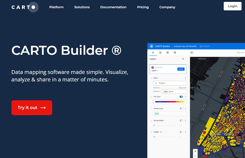
If you’re looking for an easy-to-use mapping and data visualization software, then Carto Builder is the software for you. With Carto Builder, you can create beautiful maps and visualizations, easily connect your spatial data, and carry out spatial analytics at speed. Plus, you can rapidly prototype apps and share your insights with others.
With its easy-to-use interface, you can create stunning maps in minutes without any prior experience. And if you ever need help, the friendly Carto Builder community is always there to lend a hand.
2. Tableau
A tableau is a great option if you want to create interactive visualizations of your data. You can also use Tableau to perform complex analyses of your data. And with Tableau’s built-in mapping capabilities, you can create beautiful maps to visualize your data.
Tableau is a powerful and easy-to-use tool. However, it’s also one of the more expensive options on this list. If you’re looking for a free option, you might want to look elsewhere.
But if you’re willing to pay for the best, then Tableau is the software for you.
3. Qlik Sense
This is another great option for those who want to create interactive visual data representation. Qlik Sense is data visualization software that allows you to see and understand your data in new ways. With Qlik Sense, you can create interactive charts, graphs, and maps that help you make better decisions.
Additionally, Qlik Sense has an excellent community and support infrastructure, which is extremely helpful for users who are new to the software or have questions about certain features.
4. Spotfire
Spotfire is easy to use and has a variety of powerful features. One of the best things about Spotfire is that it can be used for both small and large datasets, making it very versatile. It also has a wide range of visualization options so that you can tailor the output to your needs.
Spotfire also has some great analysis features. For example, you can use it to calculate statistics, create custom filters, and even conduct predictive analytics. This makes it an incredibly valuable tool for anyone working with data.
Other key features include:
- Interactive visualizations: With Spotfire, you can create interactive visualizations that help you see and understand your data in new ways
- Data wrangling: Spotfire makes it easy to wrangle your data so that you can focus on analysis instead of preparation
- Advanced analytics: With Spotfire, you can perform advanced analytics on your data to uncover hidden insights
- Collaboration: Spotfire lets you collaborate with others on your data analysis so that you can make better decisions together
- Publishing: Spotfire makes it easy to publish your data visualizations so that you can share them with others
- Integrations: Spotfire integrates with other business intelligence tools so that you can get the most out of your data
- Security: Spotfire takes security seriously, so you can be confident that your data is safe
- Scalability: Spotfire scales easily so that you can grow your use of the platform as your needs change
- Support: Spotfire offers world-class support, so you can get help when you need it.
Overall, Spotfire is an essential tool for business intelligence because it helps you see and understand your data like never before. With Spotfire, you can create interactive visualizations, uncover hidden insights, and make better decisions.
5. Microsoft Power BI
Microsoft Power BI is a data visualization tool that allows you to see your data in a whole new way. It lets you transform your data into stunning visuals that can be embedded in your app or website. With Power BI, you can easily answer complex questions and get insights into your business that you never thought possible.
Here are features that make Power BI stand out from the crowd:
- The ability to connect to almost any type of data source
- A rich set of built-in visuals
- Interactive reports and dashboards
- Natural language query
- Real-time analytics
6. Oracle Business Intelligence Enterprise Edition (OBIEE)
Oracle Business Intelligence Enterprise Edition (OBIEE) is a data mapping and visualization software that allows users to create reports and dashboards. OBIEE is a powerful tool that can help organizations make better decisions by providing insights into their data. The software is easy to use and provides a wide range of features, including:
- The ability to connect to multiple data sources
- A drag-and-drop interface for creating reports and dashboard
- A library of pre-built reports and dashboards
- The ability to share reports and dashboards with others
- Integration with Oracle applications such as Salesforce, Siebel, and PeopleSoft
7. IBM Cognos Analytics
IBM Cognos Analytics is another easy-to-use data mapping and visualization software that allows users to see patterns and relationships in their data. The software has many features that make it a valuable tool for businesses and organizations. Here are the most important features:
- The software can be used to create maps that show data relationships. This is useful for finding trends and understanding complex data sets
- The software can be used to create charts and graphs. This is useful for visualizing data and seeing trends
- It can be used to create reports. This is useful for sharing information with others or making decisions based on data
- The software can be used to access IBM Watson services. This is useful for getting insights from artificial intelligence
Tips On How To Get Started With Data Mapping And Visualization
There are many ways to get started with data mapping and visualization, but the most important thing is to have a clear understanding of what you want to achieve. Once you know your goals, you can begin planning your data map. Here are a few tips to help you get started:
- Start by identifying the source of your data. This could be an internal database, a web API, or even a paper document
- Next, determine the format of the data. This will help you choose the right tool for mapping your data
- Then, decide how you want to visualize your data. This could be a simple spreadsheet or something more complex like a heat map
- Finally, create your data map and illustration. This can be done using a variety of software tools discussed above, but the most important thing is to make sure that your map is accurate and easy to understand.
- Once you have created your data map, you can begin using it to answer questions and make decisions
- Always remember that data mapping is an iterative process, so don’t be afraid to revise your illustrations as new information becomes available. By following these tips, you’ll be well on your way to creating informative and impactful data maps and better visualizations.
Conclusion
In conclusion, while data mapping software can be a powerful tool for better understanding and visualizing your data, it is important to choose the right software for your needs. The software we’ve highlighted in this article are all great options with different features that may work well for your organization. So don’t wait any longer! Start exploring these tools and see how you can use them to improve your business operations.