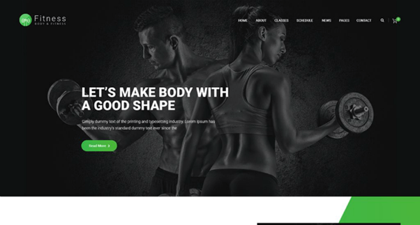
Creating a successful fitness website requires you to think from the perspective of health enthusiasts. Your website should be attractive and easy to use and, at the same time, encourage visitors to develop healthier lifestyles. This, of course, is easier said than done. That’s why we have shared some top tips and design inspirations below to help you get started.
1. Start with a Great Template
Your website’s design template will lay the foundation of the entire website. It will establish both the user interface (UI) and user experience (UX). So, even though there are all kinds of WordPress themes and templates online to choose from, take your time and pick the perfect template.
Apart from the visuals, there are some other things you need to look for. For instance, the template should be responsive to mobile devices so your visitors can use your website easily on small screens. You don’t want to clutter your website with fancy/unnecessary graphic elements. Simple and minimalistic is often incredibly powerful.
2. Create a Powerful Logo
There are many fitness and wellness websites on the Internet. If you want to make your website stand out, you must consider branding. A powerful brand comprises several ingredients, including company values, mission statement, brand voice, etc. However, all of these are represented visually through a unique logo.
You can study some of the best fitness logo examples online to learn the basics of the top-notch logo. You can draw inspiration from these designs and come up with your own attractive website logo. That said, don’t just borrow cliched ideas (a flexing arm, abstract man/woman, a lion or bear representing strength, etc.)and try to think in a direction that’s not so obvious.
3. Create Content That’s Engaging and Educational
So many fitness websites try hard to sell their products and services to visitors. This approach is usually ineffective and doesn’t generate long-term and loyal customers. What you actually need is to incorporate all ingredients for great Content , and at the same time, give your visitors what they really need.
Your website needs to address some of the most common questions about health and fitness. First, try to educate and entertain, and once you have engaged the visitors, bring out the merchandise/services that you have to offer. Focus on the value proposition—how to share knowledge. When you create value, people will visit your website, and they will convert!
4. Don’t Forget the Basics
You are free to be as creative as you want with your fitness website. However, you have to keep the basics in mind. For instance, your website must have the essential pages, which are:
- Home
- About Us
- Contact Us
- Services
- Privacy Policy
- Blog
5. Use Compelling Visuals
Visuals play a huge role in a website, irrespective of the website’s niche or business domain. Think about it- an average user spends around 7 seconds on the website they visit. That’s all the time you have got to convince the person to stay. So, make sure that your fitness website’s visuals, let it be the images, videos, dynamic effects, etc., are up to the mark, creative, and appealing. If you don’t have a big budget for visual assets, you can find free online resources. For instance, you can visit pexels.com to download professional but copyright-free images (of gyms, healthy food, athletes, etc.) for your website. There are many websites where you can download free unique fonts- 1001freefonts, font squirrel, etc.
Conclusion
Creating a high-quality fitness website isn’t easy. It would help if you planned everything- the overall theme, the messaging, visuals, etc. Of course, studying your closest competitors can give you plenty of good ideas to get started. However, it would help if you put your spin on the ideas you finalize. In fact, the more creative and original you are with the design, the better. Good luck!

