There are many benefits to an interactive web design. The more engaged users become with your page, the more likely they’ll hang around long enough to start the buyer’s journey. Keeping them moving through each step helps improve your conversion rates.
According to Internet Live Stats, there are approximately 1.85 billion websites in the world, but not all are active at one time. Some point to other domains which are defunct or waiting to go live. No matter how you dice it, though, you’re competing with other businesses for consumer attention. You can search for Bay Area web design firms for attractive designs.
If you want to grab interest away from social media, texts, video streaming, and hundreds of other distractions, you must make your site engaging. Adding interactive elements is the most efficient way of keeping site visitors around.
Here are a few you can try to enhance the performance of your business site. We’ll also share some examples of other companies doing an excellent job with their online presence.
How To Incorporate Interactive Web Design Into Your Business Site
1. Ask For Reviews
2. Reward Engagement
3. Lay Out The Steps
4. Encourage Sharing
5. Tweak Your CTAs
6. Improve Mobile Responsiveness
1. Ask For Reviews
Gathering feedback from your regular customers helps engage users on two levels. Those leaving a review feel connected to other customers and shoppers. They know they’re providing a valuable peer service and sharing what they love or hate about a product.
Those visiting your site for the first time have no reason to trust you as a company. When they see what others have to say about your quality of service, you become more reliable in their eyes.

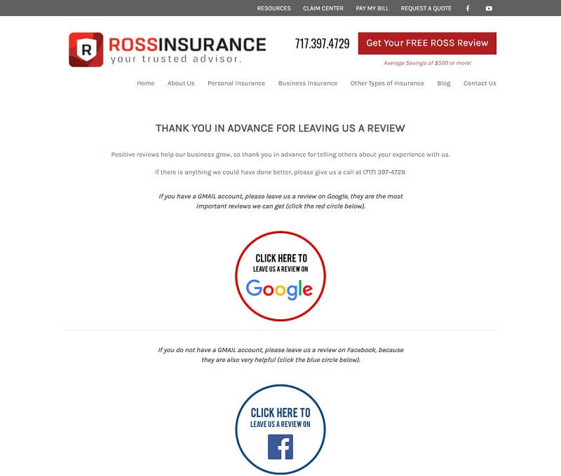
Ross Insurance dedicates a page to asking for customer reviews. They explain why a Google review helps them the most, but they also explain that Facebook reviews help some. They provide clear links to each review site, making it as simple as possible for people to leave one.
2. Reward Engagement
Think about what makes you click through to different areas of a website. How can you reward your visitors for moving through your sales funnel? Offering a freebie to share their email is one simple way to engage the user and convert them into a subscriber.
You can also reward long-time customers by starting a referral program. DirectTV is a company that offers a great reward program. When someone new signs up, they get $50 off, and the person who referred them does as well. It’s a win-win for both parties.
3. Lay Out The Steps
Another way to keep people moving smoothly through your business site is to explain the steps they need to take. If the user knows there are three or four steps, then they don’t feel as though they are endlessly clicking through pages.
Try to keep the number of movements to five or less so users don’t feel overwhelmed. Explain what each step involves and then move the customer through the sales funnel toward conversion.

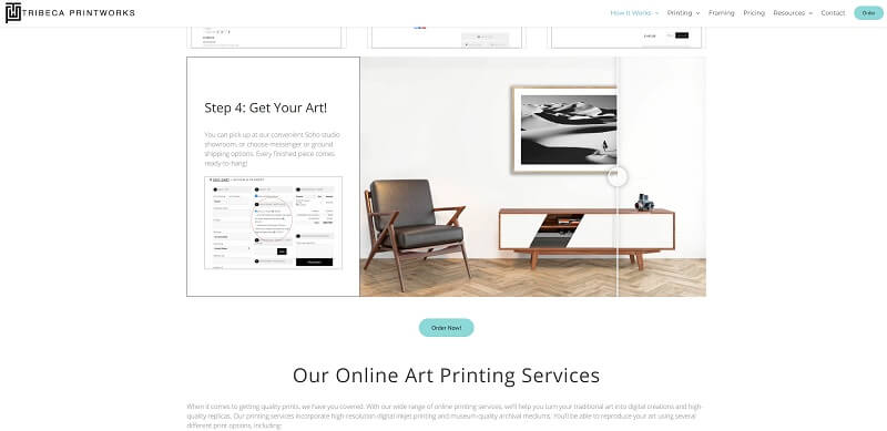
Tribeca Printworks does an amazing job of showing the specific steps needed to take your art from an idea to a framed masterpiece. Note how each step is very detailed, outlining exactly what you’ll need to complete that movement.
4. Encourage Sharing
More and more people get on social media each day. With so many staying home more due to the pandemic, the number of users on social platforms exploded in the past year.
According to Pew Internet Research, around 93% of Americans use social media to stay in touch with family and friends and for entertainment. It’s a way to stay connected with others in a time when social distancing is the norm.
Add the ability to share content easily on social media to boost your interactivity and bring in additional traffic. You can gain a lot of free word-of-mouth marketing simply by creating valuable content and making it easy to post to popular platforms.
5. Tweak Your CTAs
Your call to action (CTA) buttons are one of the interactive elements on your page. They encourage users to take action, are easy to spot, and are clickable.
However, the placement, color, and even wording on your CTA can cause them to underperform. Start by looking at the color. Does it contrast with the other elements on the page? Is it one of the first things the user sees when they land?
Next, consider the size of your CTA button. Is it large enough to signify it as an important part of the website? Will the size cause users to sit up and take notice?
Finally, tweak the words. You want action words, short phrases, and a clear explanation of the benefits of clicking on it. For example, “Get My Free Guide.”

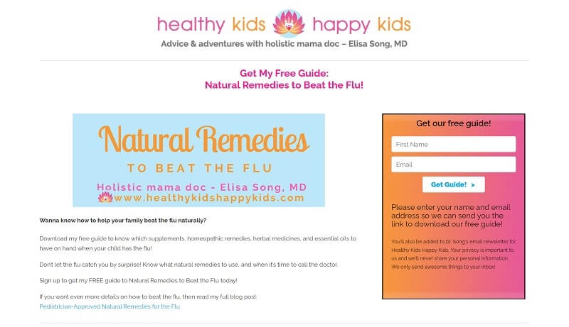
Healthy Kids Happy Kids offers advice on keeping your children healthy with a holistic medicine approach. Note how they offer a free guide on how to help your family beat the flu naturally. The guide taps into a desire the target audience has and then offers the guide if you share your email. The CTA reads, “Get Guide!”
6. Improve Mobile Responsiveness
The majority of people now access the internet via their mobile devices. If you want your site to be highly engaging, you must make it so for any screen size. Double-check how well your images, text, and CTAs adapt to smartphones. However, if your website needs to be set up properly, this could be a very challenging task. That’s why many business owners go with one of the best Los Angeles web design companies that are ready to meet their website design standards and requirements.
Do you need help filling in forms on a mobile touchscreen? How can you make the process easier? Look for ways to create an intuitive site no matter how your visitors come to you.
Be Present
Tweak the design and the features you offer to engage site visitors. Be an active participant on your website. Respond to questions quickly, thank people who share your posts on social media, and have discussions with your site visitors. The more of your personality you show, the more likely they’ll return.
That’s all from this blog. I hope you liked this article on incorporating interactive web design into your business site.
Also, if you like this article, please share it with your social media followers, such as Facebook, Twitter, etc.

