
In this article, we will discuss the five simple ways to make your blog more appealing. So keep reading.
In a highly cluttered and competitive online space, you want your blog to get its due attention. However, simply writing insightful, thoughtful, and amazing content might not get you the consideration you seek. The best content requires an equally appealing website design to get the readers to stay on the page.
Humans are visual creatures drawn toward attractive aesthetics. Creating a visually arresting and perceptive design ensures that your content grabs eyeballs immediately. Conversely, a poorly designed webpage loses viewers’ interest long before they can peruse the content.
Moreover, we live in an age dominated by social media and constantly refreshing newsfeeds. When a user clicks on your post on one of the social media platforms and lands on your webpage, you want the web design to create a powerful first impression. Once you have generated a strong impression, viewers are more likely to interact with your blog. Thus, a potent combination of informative content and incredible aesthetics is the key to a successful blog.
Below, we have discussed a range of factors that contribute to an effective and engaging website design:
5 Simple Ways To Make Your Blog More Appealing
1. Design An Attractive Theme
2. Enhance Readability
3. Include High-Quality Images
4. Employ Minimalism In Your Design
5. Improve User Experience
1. Design An Attractive Theme
When you launch your blog, the first thing to consider is the best design theme suitable for your content. You can either choose one amongst the various templates available online or hire a web developer.
The design template includes your site’s overall color scheme and layout. It incorporates consistency across your site, and every new blog post conforms to the consistent design. A striking and well-designed theme invites viewers’ interest and helps promote your blog’s credibility and authority.
In addition, colors play a defining role in making your web design appealing. A captivating and minimalistic color combination draws attention to your blog and prompts the brain to make a subconscious decision about whether your page is interesting enough to stay.
Thus, use up to two to three base colors that complement each other and then add varying (lighter or darker) shades of these hues to enhance the color palette. Look into colors that evoke certain emotions, such as blues, which are calming, while reds are energetic and passionate. Avoid the temptation of using too many colors, as the end product might be jarring, chaotic, and deterring.
Another aspect of the design theme is its layout. A well-balanced web page looks beguiling and calming at the same time. It draws the eyes systematically across the board and ensures that the users get all the details. The last thing you want is to agitate and alienate your audience with a disorganized outlook.
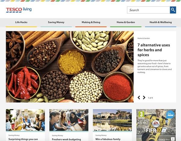
Visual balance refers to the intelligent stacking of the design elements for a cohesive appearance. You can create a harmonized design by ensuring the right and left sides of the page are balanced (symmetrical balance). And you can complement a visually heavy element with a few lighter ones on the other side (asymmetrical). You can also place your elements around a focal point (radial balance). Following are a few examples of well-adjusted pages.

2. Enhance Readability
The entire purpose of your blog is to invite users to read your content. Your subject matter might be amusing and insightful, achieving the perfect balance between entertainment and information. However, if your font needs to be bigger and more appealing, it can be a major turnoff for potential readers.
Make your posts as readable as possible by using clear, evenly-spaced fonts, such as Roboto, Oswald, Montserrat, or Open Sans. Use different but complementing typographies for headings and subheadings to create a visual hierarchy. The typography you choose should reflect the personality of your blog. For example, Sans Serif fonts are ideal for professional blog headings, while Script is more suited for lifestyle blogs.
Another significant factor for improving the readability is the font size, which should be at least 12pt or 16 pixels. Proofread to ensure the viewers do not have to squint to read the text and increase it accordingly. Moreover, if your target audience includes an older demographic, you should consider an even larger font.
Next, split your blog post into smaller paragraphs and use subheadings and bullet points to break down the text further. Nothing looks duller, boring, and uninviting than a block of text. Ideally, each paragraph should have a maximum of three to five sentences, expressed as concisely as possible.
Finally, pay attention to the line’s length and spacing to enhance readability. Limit the number of characters per line to seventy or eighty, as long lines can be confusing for the eyes.
Line spacing is usually expressed as a percentage of the font size—the sweet spot for line spacing that renders the text readable lies between 130% and 150%. However, you should always experiment to see what is most suitable for your website.
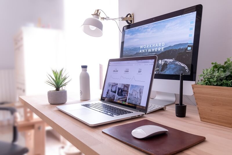
3. Include High-Quality Images
Adding high-quality images makes your websites more attractive and your posts more engaging and memorable. Information paired with relevant pictures is also more receptive and comprehensible than bland blocks of text.
Therefore, include featured images at the blog’s beginning that narrate the contents of your post at a glance. You can also add more pictures pertinent to your content between the blog to break up the textual monotony.
The featured image should be original and inspiring, as it will appear on all your social media platforms. Choose a picture that makes your post more visible and shareable on the newsfeeds and directs the users to your blog posts.
While various websites share stock photographs for convenient use, you can gain more benefits by using unique images created or clicked by you. Firstly, Google recognizes original content from an SEO perspective, directing meaningful user traffic your way. The audience also appreciates authentic images, as they are exclusive to your blog and show your commitment to quality.
Lastly, ensure that your photos have a consistent feel so people can immediately relate your images to your blogs. For example, if you run a food-related blog, use a similar background for all your food portraits to set yourself apart from the competition. Love and Lemons is a food blog that features all its dishes on a white marble background for a cohesive outlook.

4. Employ Minimalism In Your Design
Highlight your content by reducing unnecessary clutter from your web page that draws attention away from the core purpose of your website. Too many design elements can be paralyzing for the audience, who will quickly abandon your page instead of interacting with your content.
Avoid stuffing your sidebars, headers, and footers with things that do not necessarily belong there. Before including any additional design aspect, ask yourself if your page can still deliver without its presence and remove it if the answer is affirmative.
Create lots of white space that provide visual reprieve and distinguish each element from the next. Viewers are also more likely to absorb more information when it is presented in a neater format.
5. Improve User Experience
Another facet of web designing is the user experience. The minimalistic design also reduces the page load time and allows you to retain your visitors.
According to research, 53% of mobile users abandon a page that takes more than three seconds to load. Therefore, avoid too many plugins and widgets that affect your site-load time and cause you to lose prospective readers.
Moreover, create a responsive design that fits seamlessly to any screen size. Your users might be using their phones, tablets, or laptops to access your site. If your blog does not translate well into a smaller or larger screen, it can adversely affect the user experience and alienate your audience.
Conclusion
The content, design elements, and usability combine to create an appealing website design. An attractive theme, original photos, and an enriched user experience can improve your SEO and earn you more user traffic. Simultaneously, enhanced readability and a minimalistic, uncluttered design help you retain the audience long enough to generate meaningful engagements.
So that’s all from this article. I hope you liked this blog post about five simple ways to make your blog more appealing. Please share it with your friends and social media followers.
Author Bio
Erica Silva is a blogger who loves to discover and explore the world around her. She writes on everything from marketing to technology. She enjoys sharing her discoveries and experiences with readers and believes her blogs can make the world a better place.